

Pie Charts: An Effective Data Visualization Tool?


.png)
Data visualization is a key part of the data analysis process, providing insights that drive informed decision-making in a user-friendly and engaging way. While a variety of visualization techniques are available, one approach often seen as controversial is pie charts.
In this blog post, we’ll do a deep dive into pie charts. We’ll explore why they stir debate, how to use them effectively, and specifically, how to leverage them specifically to draw insights from spatial analytics.
Despite their ubiquity, pie charts have faced criticism from prominent figures across data visualization, including John Tukey who famously said “There is no data that can be displayed in a pie chart, that cannot be displayed BETTER in some other type of chart.”
The primary objections revolve around the pie chart’s circular shape making it difficult to interpret precisely. When looking at a bar chart, for example, it is easy to refer to the Y axis to determine the exact volume each column refers to; with pie charts, this is virtually impossible to do without data labels. Furthermore, the pie chart can only function to allow the user to compare relative proportions, not overall amounts.
So, they have their shortcomings. But doesn’t every data visualization technique? Whether it’s a bar chart, a line graph or a scatter plot - every element of a data dashboard can be employed effectively or misused entirely. So… how can you make the pie chart work for your data visualization?
Here are 5 principles to employ to ensure your users can effectively interpret your pie chart:
- Emphasize Key Data Points: Be selective! The more segments of your pie, the harder it is to interpret.
- Strategic Use of Color: Choose a color scheme that not only distinguishes each segment but also directs attention to an emphasized slice to leverage the Gestalt Principle of Connectedness.
- Utilize Data Labels: Incorporate data labels strategically to provide additional context without cluttering the visualization.
- Meaningful Titles: Use the title to add context and impact.
- Maintain Simplicity: Simplicity ensures that the audience can quickly grasp the intended information without being overwhelmed by unnecessary details.
And if you want to take this even further? Try a doughnut chart (in action below)!
Doughnut charts are a type of pie chart, distinctive by their hollow center. Why does that mean they can be easier to interpret than “filled” pie charts?
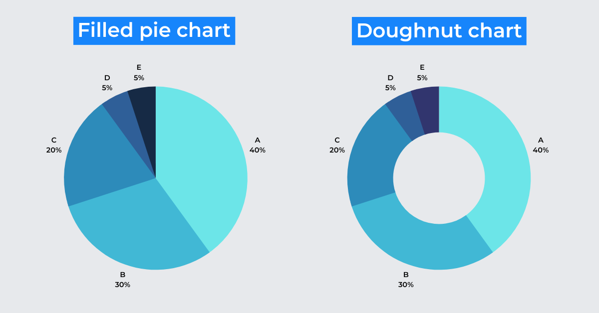
It’s about how our brain processes the information presented. When you “read” a filled pie chart, your eyes will naturally be drawn to the center meaning we differentiate between the data points based on each segment’s area. With no central point, when we interpret a doughnut chart, our eyes travel around the circumference of the doughnut’s ring. This means we are judging the data based on each segment’s length; something humans inherently excel at.
The crucial distinction lies in how our brains process visual information. While pie charts are viewed holistically, with attention drawn to the center, doughnut charts, being hollowed out, prompt the viewer's gaze to traverse the circumference. This distinction is more than a cosmetic difference; it taps into how humans inherently excel at judging linear distances.
Pie - or doughnut - charts can be an incredibly useful component of a data visualization. When data is displayed spatially, it can be difficult to understand the proportions of different variables as they are not grouped together in any meaningful way.
Take the below map for example. This is an example of Cannibalization Analysis. The red points represent McCafes and the blue Starbucks; the blue hexagons indicate areas where the Starbucks potentially “cannibalizes” (i.e. draws potential custom) from McCafes.
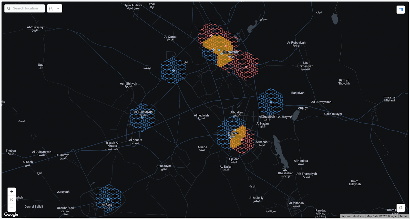
When you look at the map, how easy is it to compare the size of the cannibalized market vs the non cannibalized market? It’s pretty difficult - right?
Now explore the full map below (or in full screen here). The map creator has added a series of widgets to aid the user’s understanding of their analysis, including a Pie Widget. This shows a clear comparison of the cannibalized vs non cannibalized market sizes.
You can use the Pie Widget with any query or table in CARTO Builder which has one categorical variable which must be in string format. Sign up to a free 14-day trial to try this out yourself!
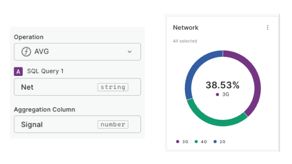
When configuring the Pie Widget, you can simply show the count of features for each category of your data, or aggregate other numeric variables to be displayed on the pie using AVG, MAX, MIN, or SUM operators. You can also adjust the pie to operate at the “Global” or “Viewport” level, meaning its display will be dictated by either the entire global dataset, or just the data currently in view. You can even further customize the appearance of the widget with Markdown syntax!
---
We hope you enjoyed this deep-dive into using Pie Charts for spatial data visualization! Start crafting your own dashboards today with a free 14-day trial!